-
Welcome to ANG Traders
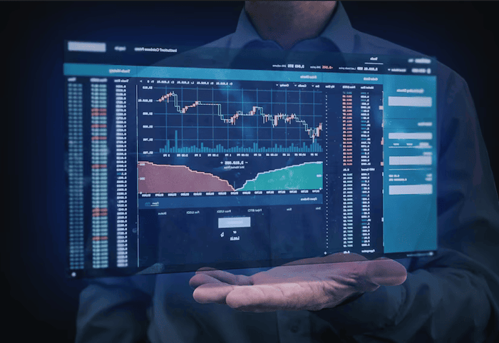
Learn trade executions, trade analysis and market strategy.
ANG Traders

Don't have an account?Sign Up
Learn trade executions, trade analysis and market strategy.